


What's new in stickers? (June 2024)
In this issue: a rainbow of colours, vintage labels, RPG, and Muppets/Pride

I just read a biography on Richard Hunt, and I’m in a Muppety mood. Let’s dive in.
Sticker the Rainbow
Pipsticks (yes, them again lol) will release Sticker the Rainbow in July. It has 1500+ stickers, organized by colour, one of my favourite ways for things to be organized.

I am very interested in the book, but disappointed in the price.


Not a fan of this either:

I don’t want a free copy, I don’t want a discounted copy, I just want it to be available here, at a decent price. By far not a pressing social issue, but a silly inconvenience, nonetheless.
Hotel Retro: Vintage Luggage Labels from Tokyo to Buenos Aires: 250 Travel Ephemera Stickers
From Letterform Archive (Instagram). This looks very fun! Coming November 2024.

The Düngeonmeister RPG Sticker Book
Coming February 2025 - “gaming–inspired stickers that include a menagerie of monsters and art for every character type, along with sticker inspiration points, status effect stickers, dice art, gamer jokes, and more”

Muppets 1
Long-time Muppet fan site Tough Pigs has these great Pride Exclusive stickers on their TeePublic:

That’s not even their entire collection. “A Person in Your Neighborhood” in pride colours? Yes please.
Muppets 2
In new old sticker news, professional seamstress/fibre artist/Muppet replicator (what a job title!) Emily Engel (Etsy, Instagram) has vintage replica stickers for sale:

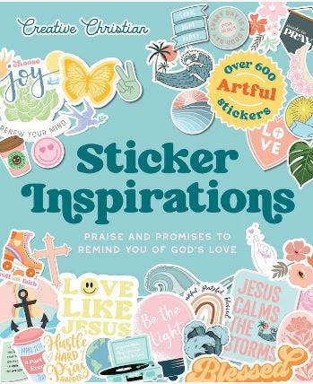
Sticker Inspirations
Sticker Inspirations (March 2025) - My household is extremely atheist/agnostic. But maybe you or someone in your life is a super inclusive person who would love some Jesus stickers, and for that, they have an option.
So Much Yellow
I already listed this release previously, but now the cover is out for The Met Collector’s Sticker Anthology. Please discuss.

137 days until Halloween!
I love your newsletter!
Not loving that Met Collector's Sticker Anthology cover tho. I'm not a designer and certainly not an 'expert', but it's....weird ? To my eye it's not pleasing; the items on the cover seem jumbled up with no rhyme or reason and my eye doesn't know where to look. I don't mind the 'busy' look but I'm baffled by this one.
I'll be interested to see if anyone else feels the same, maybe I'm just not getting it.